Rewards Gallery Redesign
UX Design | UI Design | Interactive Design | Prototyping | A/B Testing
Redesigning the Buddies Rewards Gallery: A Faster, More Intuitive Redemption Experience
Client:
Genneral Mills
Role:
UX/UI Designer
Year:
2022

Introduction
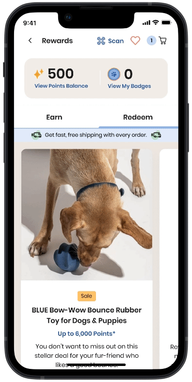
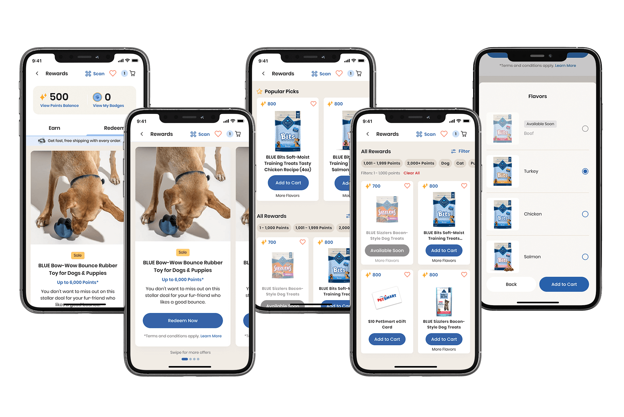
The Rewards Gallery in the Buddies app allows users to redeem loyalty points for products and digital rewards. However, the original design relied on a carousel layout, requiring users to swipe through items one by one, making browsing tedious and inefficient. This led to frustration, drop-offs, and missed redemption opportunities.
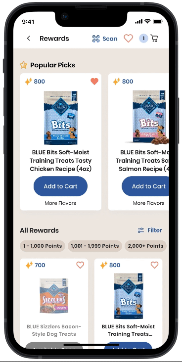
The goal of the redesign was to improve usability and efficiency by replacing the carousel with a mixed grid and carousel layout. This new structure allowed users to see more rewards at a glance, quickly compare options, and make faster redemption decisions. By streamlining navigation and enhancing accessibility, we aimed to boost engagement and conversion rates.
The Challenge
Existing Issues:
The carousel-based navigation made browsing slow and frustrating.
Users had no easy way to compare multiple rewards at once.
Filters were limited, making it difficult to find relevant items.
The free shipping banner took up excessive space, distracting from available rewards.
Redesign Goals:
Introduce a grid layout to improve visibility and reduce friction.
Enable quick reward selection with an “Add to Cart” option.
Improve filtering to help users find relevant rewards faster.
Optimize promotional item placement for better engagement.
Project Planning & Strategy
Collaborating with Stakeholders
I worked closely with the Design, Product, and Loyalty teams to define project goals, gather requirements, and align on priorities. We identified key pain points through:
User feedback highlighting frustration with the carousel navigation.
Data analysis revealing high drop-off rates in the Rewards Gallery.
Competitive research on best practices in e-commerce reward systems.
Key Design Requirements
Before diving into design solutions, we established core requirements to guide the Rewards Gallery redesign. These were defined in collaboration with the Design, Product, and Loyalty teams to ensure a seamless user experience.
📐 Layout & Structure
Grid-Based Display: The new design must replace the carousel format with a structured grid layout for better product visibility.
Optimized Reward Cards: Cards should be resized to fit efficiently within the grid while maintaining clarity and usability.
🛒 Redemption Flow & Usability
Quick Add-to-Cart: Users must be able to add rewards to their cart directly from the gallery view.
Variant Selection: A dropdown must be included to allow users to choose different product options (e.g., flavors, sizes) before adding items to the cart.
🔎 Filtering & Navigation
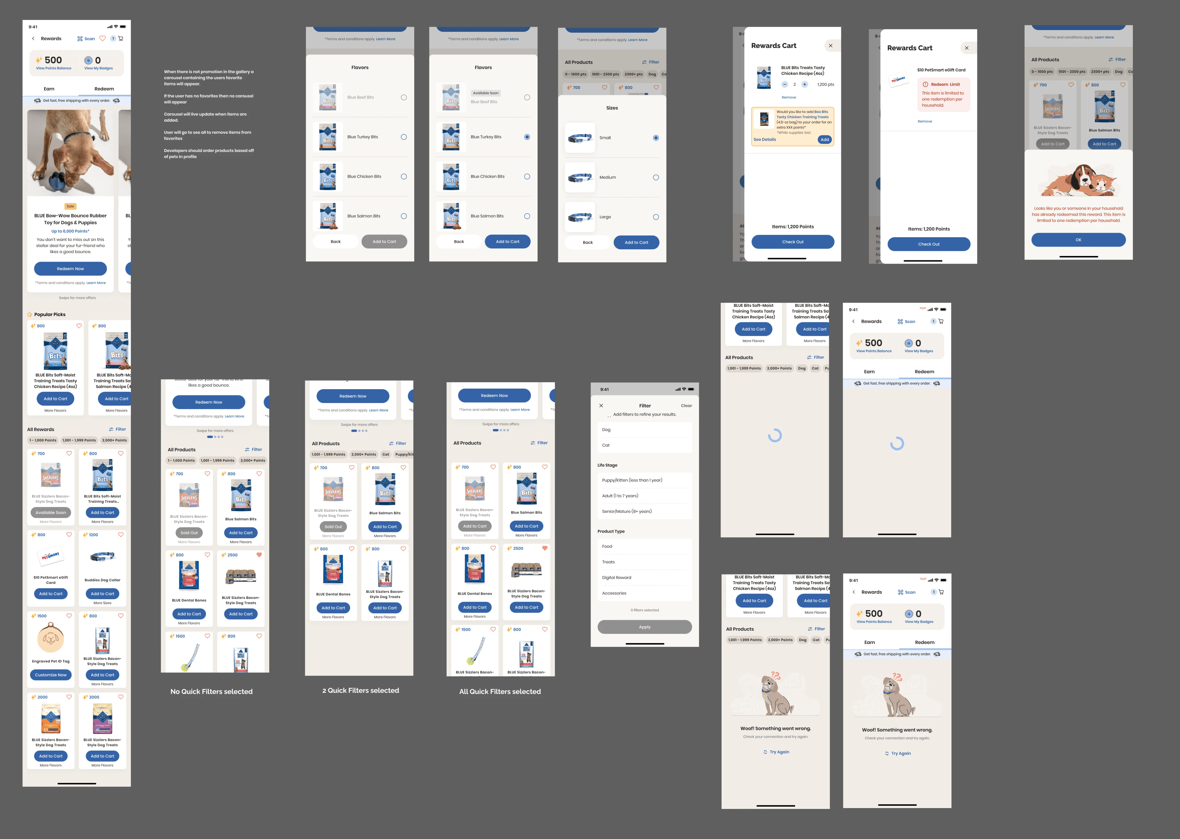
Streamlined UI Filters: The previous filter cards must be replaced with a more user-friendly filtering system that includes:
🎯 Point Range
🐾 Pet Type
🍼 Life Stage
📦 Product Type
Dynamic Digital Rewards Category: If digital rewards (e.g., eGift cards, coupons) are available, the UI must dynamically surface this category.
🎯 Promotion & Visibility
Pinned Items Feature: The system must support pinning featured rewards to the top of the gallery for promotions.
Optimized Free Shipping Messaging: The existing free shipping banner must be redesigned to take up less screen space while still being noticeable.
Design Process
1. Research & Ideation
I conducted a competitive analysis of e-commerce rewards programs to identify best practices in filtering, product display, and quick-add functionality. Key findings informed early sketches and wireframes, which were refined through stakeholder feedback.
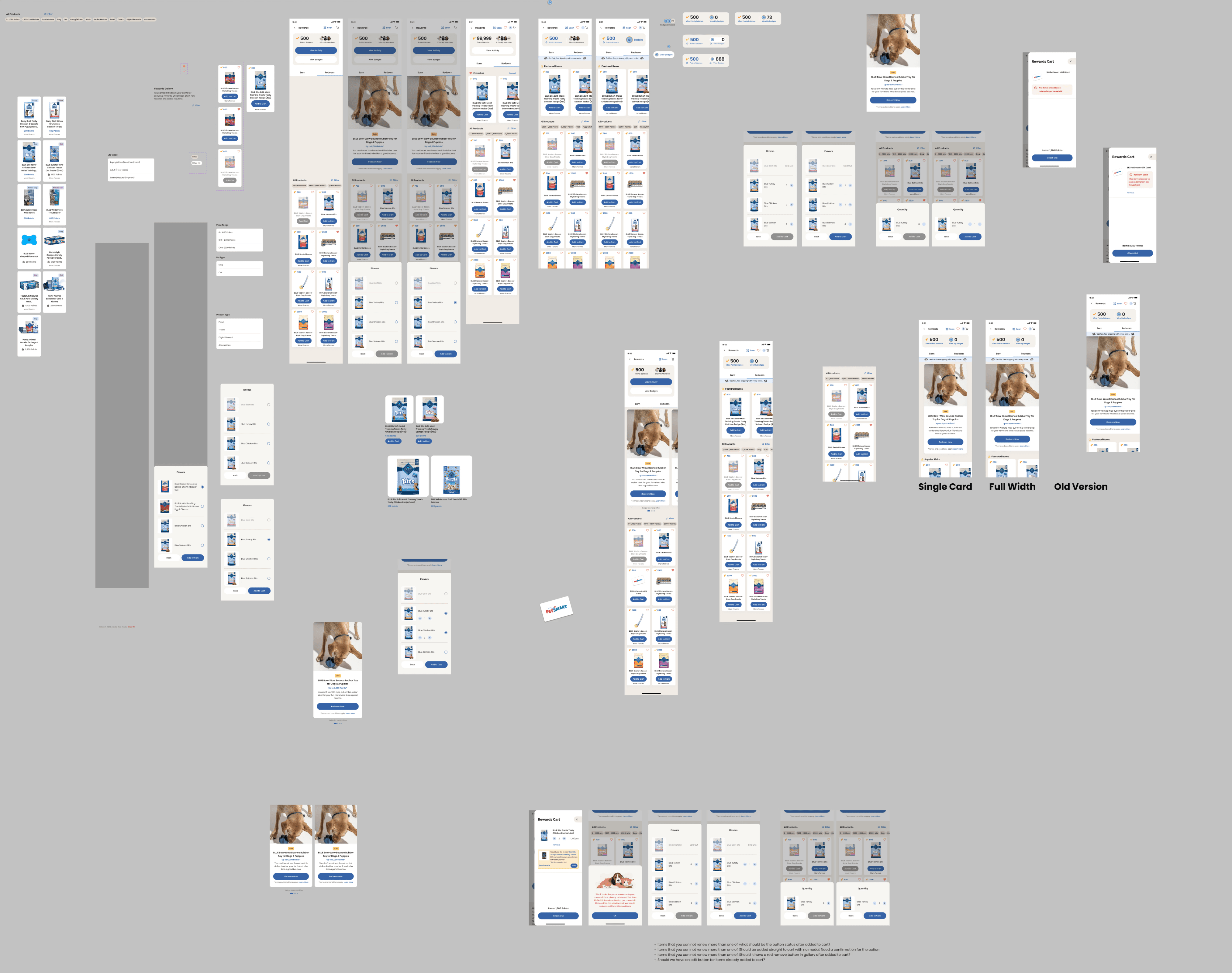
2. Wireframing & Prototyping
Using Figma, I created interactive wireframes to test different grid structures and UI elements. This allowed us to iterate quickly and ensure that the final layout provided:
A clearer visual hierarchy to prioritize high-value rewards.
A mobile-friendly grid that maximized screen space without overwhelming users.
Optimized filters to simplify product discovery.
3. User Testing & Refinements
Usability testing helped validate design decisions and identify areas for improvement. Based on user feedback, we made key refinements:
Adjusted spacing and grouping of filters for easier selection.
Improved the contrast and visibility of key CTAs.
Reduced visual clutter in the header and promotional sections.
A/B Testing & Results
To measure the impact of the new design, we conducted an A/B test, rolling out the redesigned Rewards Gallery to 25% of the user base, using the old layout as the control.
Key Findings:
📈 28% increase in reward redemptions.
📉 35% reduction in drop-off rate within the Rewards section.
⏳ 30% faster reward browsing time, making the experience more efficient.
💡 Higher engagement with promotional rewards, leading to increased conversions.
The results confirmed that the new grid-based layout significantly improved the user experience, reducing friction and increasing loyalty program participation.
Final Thoughts
This project demonstrated the power of user-centered design in optimizing e-commerce experiences. By replacing the carousel with a structured grid, simplifying navigation, and enhancing filtering, we created a faster, more intuitive redemption process.
This case study highlights my ability to collaborate cross-functionally, leverage data-driven design, and implement iterative improvements that drive real business impact.